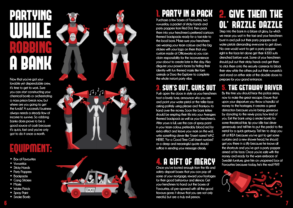
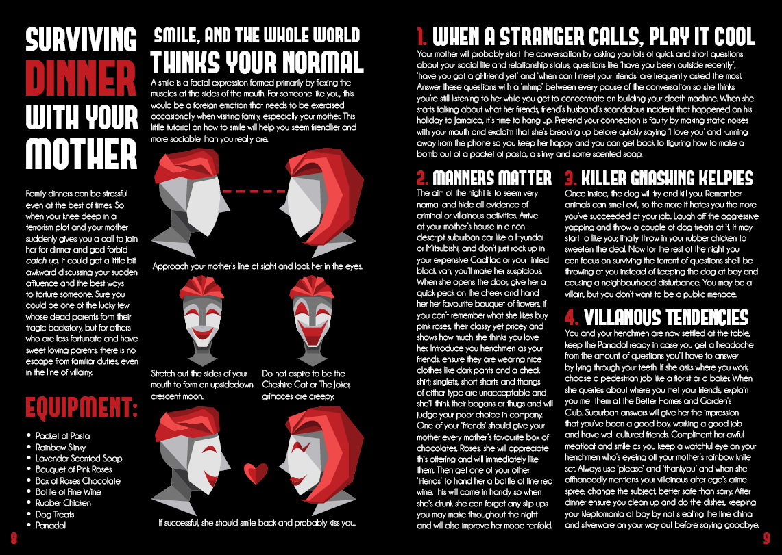
The cookbook’s criteria requires me to create an engaging and immersive recipe book with clear hierarchies and smart grid system with text that is legible as well as readable. The finished product should have a minimum of 12 pages including a cover, contents, introduction, recipes and an instructional diagram.
THEME: I decided that the theme of this project would not be centred around making an actual cookbook, instead I will use the same format of a recipe but applied to a different topic that I feel I can be more creative and enjoy producing. Therefore I wanted to do a ‘How To’ book on a subject I have more knowledge in and can have fun with the content, ‘Villains’. The genre of my book would be a ‘How To’ guide but also dips it‘s toes into comedy and comic book territory.
TARGET AUDIENCE: So my resulting target audience would be teenagers to young adults who have an interest in not only villains in general but interesting comedic twists to some dark topics that might make the audience chuckle.
-
Featured in Edith Cowan University's annual School of Arts and Humanities Graduate Exhibition 'ArtsHum 2015' for their student work category - Bachelor of Creative Industries.
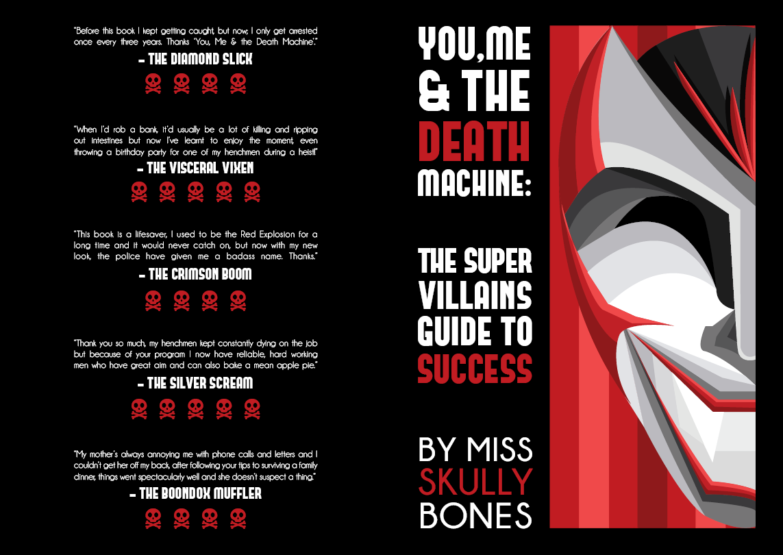
Initially for my images, I took inspiration from the ‘Spy; Original Motion Picture Soundtrack’ cover which has a simple retro style which I think paired with dark bold colours like purple, black and orange would set a great villainous vibe. The minimalist style and lack of texture reminds me of the comic book style which is convenient as some of the greatest supervillains in my opinion come from comics.
So to begin thinking about the layout of my book I went ahead and did some research on the layouts of ‘How to Survive Anything’ and a double spread from Guardians of the Galaxy which had a similar theme or style that I could use to influence my final layout.
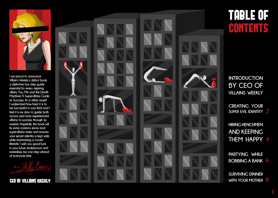
Using what I’d learnt about format from my research, I sketched out a possible layout which consisted of an entire picture being the background, with the most detail and contrast in open space. I liked the idea of the rule of thirds and will have the title, description and equipment stacked on top of each other in one third of the page while the detailed picture takes up the rest. For the other page I was just going to bunch the information in rectangles with a lot of space in between and around them.
First I found the font’s I wanted. For the title I used ‘Forque’ because I wanted a more modern, blocky and slightly aggressive look which suited the comic book style wanted to achieve. ‘Champagne and Limousines’ was used for its rounded forms and thin strokes. This is used along with ‘Forque’ because they are both sans serif but differs in thickness, height and width.
For my colour choices I’ve selected the black for the background and white for all the text because they contrast each other very well. Black symbolises mystery and death which mirror the books subject matter, white on the other hand symbolises cleanliness and safety which the book teaches and provides. For the images I’d planned on using different shades of purple for not only adding a splash of colour but also symbolises power and ambition, which is conveyed through the books recipes.
I ended up keeping most things from this initial idea but I did change some things upon recommendation.
I added red accents on certain words that I felt were important in titles and headings, providing emphasis, interest and helps create focal points in the spreads. I’ve also accented numbers and letters at the beginning of paragraphs for the same reason.
I changed the font on the front cover for the author and the contents page because too much of that dense font can cause the page to look heavy and affect readability. Large bodies of text that were justified have now been changed to align left to aid readability.
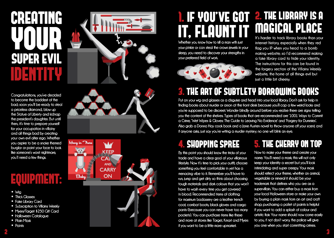
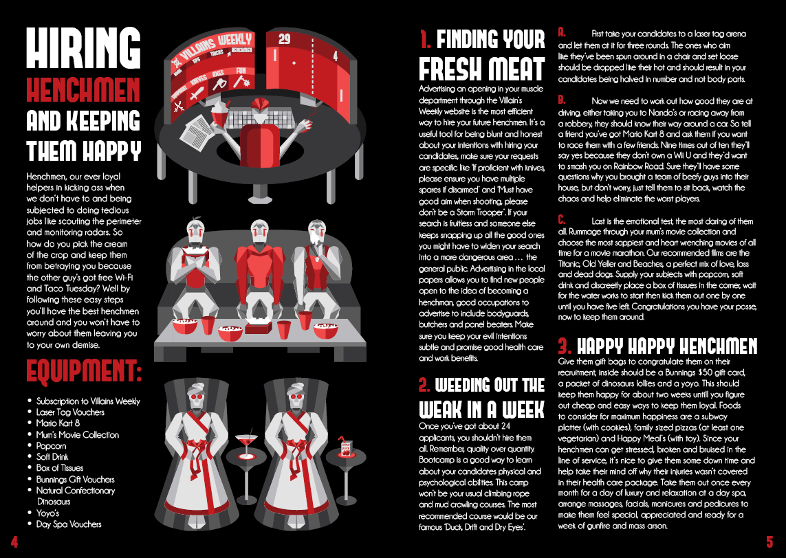
The pages with recipes have been reformatted so instead of all uneven rectangles they are in different shaped boxed reminiscent of comic book panels. This provides a unique order of reading as well as opening space in the page. I’ve placed the images for the recipes after the title, introduction and equipment to break up the large amount of text on the page.
There will be more than one image on the recipes, with each image lining up with the end of a box of text for uniformity and harmony. Headings have been kerned appropriately as some letters seemed to stick to each other. Instead of centring the headings and titles, I have edited the size of each row so they hit the boundaries of the text box to form a solid and uniform box of text.
I wanted to put as much detail into my sketches as possible so when it came to putting them in Illustrator, I could remove detail instead of adding it when necessary. Hence, I chose the drawings circled in red with the straight angular lines that use simple shapes and forms which would help convey the rigid yet simple design more effectively.
I wanted to show expression when necessary but didn’t want to leave just a flat shape. So I thought about instead of thinking of the object as a smooth surface, think of it in regards to flat planes. I then got out ‘Figure Drawing For All It’s Worth’ by Andrew Loomis and took inspiration from his drawing of a human male divided in planes for an idea where places rise and fall on the human body.
The eventually style resulted in something minimalist yet polygon-esque in nature with rigid lines and different triangles helped define light and shade.
The colour scheme was initially sources from the cover image, choosing to use only shades of grey and red. Red was an obvious choice because my cookbook is accented with this colour, but I chose grey to keep it neutral and be harmonious with the background and text colours.
I feel that my cookbook is very successful and I am especially happy at how the images turned out since I had never done that style before.