


PROBLEM: The design problem is that tourists arriving at the Fremantle Passenger Terminal by cruise liners have a limited amount of time to experience Fremantle in the most time efficient way possible before returning home. Statistics show that international and inter-state passengers provide the biggest source of tourism in the City of Fremantle and is in a position to host ‘mid-size’ and ‘mega’ cruise liners. These ships have a higher demand on port services which fuels its booming tourism industry.
SOLUTION: The design solution will have to be able to achieve an increase in Fremantle’s economy by tailoring a cheap, new and inviting service to improve their tourist time management that will inject happiness into the City of Fremantle. This is achieved using a four part service called ‘SO MUCH FREO, SO LITTLE TIME’ with the elements of a banner, Timeline Bridge, tent and brochures put into motion. By using this inexpensive and cost efficient solution, it brings awareness of the beauty of Fremantle through selection of detail of the brochure routes while also informing that the city is an inviting, safe and fun place to spend a limited amount of time.
RESEARCH: Research that was undertaken to find a solution to my design problem, was the method of first and second hand research, searching the internet, pretending to be a tourist and empathy mapped a shopper. I also performed background research on the City of Fremantle’s past initiatives and compared them to what the City of Mandurah was doing to tackle their cities unappealing appearance. I went on a cruise to become an actual tourist which gave me plenty of idea’s such as renovating buildings and incorporating a ‘Welcome to Fremantle’ sign. Using the concept of a sign, I further mind mapped and story boarded solutions until I had four prototypes to work from and select the best one.
OVERVIEW: Tourists purchase products from the businesses listed on the brochure available from the tent located near Munchies. Business owners reap additional income for their establishments from tourism. Local residents benefit from more job opportunities through economic growth. The City of Fremantle’s revenue would increase to expand infrastructure and fund new projects.
There is a strong correlation between a beautiful city and happy people. This will be achieved by improving the image of Fremantle and accommodating for tourists who have a limited amount of time to experience the city using the service ‘SO MUCH FREO, SO LITTLE TIME’.
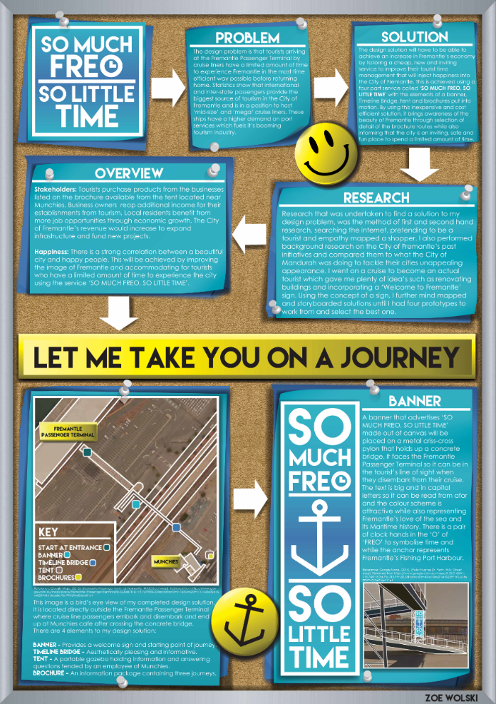
My final prototype for this project has been broken down into two parts because there are four elements to my design solution.
BANNER: A banner that advertises ‘SO MUCH FREO, SO LITTLE TIME’ made out of canvas will be placed on a metal criss-cross pylon that holds up a concrete bridge. It faces the Fremantle Passenger Terminal so it can be in the tourist’s line of sight when they disembark from their cruise. The text is big and in capital letters so it can be read from afar and the colour scheme is attractive while also representing Fremantle’s love of the sea and its Maritime history. There is a pair of clock hands in the ‘O’ of ‘FREO’ to symbolise time and while the anchor represents Fremantle’s Fishing Port Harbour.
-
Featured in the City of Fremantle's Happiness Project Closing Celebration (2014) as a Finalist.
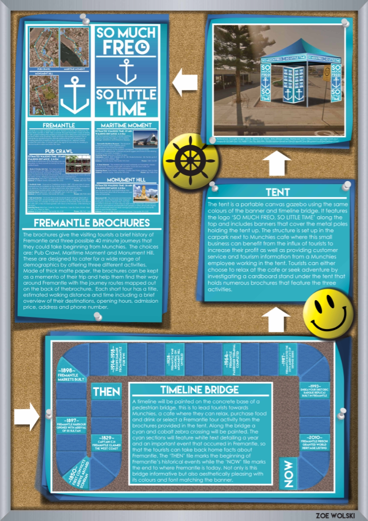
TENT: The tent is a portable canvas gazebo using the same colours of the banner and timeline bridge. It features the logo ‘SO MUCH FREO, SO LITTLE TIME’ along the top and includes banners that cover the metal poles holding the tent up. The structure is set up in the carpark next to Munchies Cafe where this small business can use the influx of tourists to increase profit as well as lend their services to tend the tent. Tourists can either relax at the cafe or seek adventure by investigating a cardboard stand under the tent that holds numerous brochures that are handed out by the Munchie‘s employee.
These brochures gives the visiting tourists a brief history of Fremantle and three possible 40 minute journeys that the tourist could take to and from Munchies. Made of thick matte paper, the brochures can be kept as a memento of their journeys and can help them find their way around Fremantle with the journey routes mapped out on the back of the brochure. Each journey has a title, estimated walking distance and time including a brief overview of their destinations, opening hours, admission price, address and phone number.
TIMELINE: A timeline will be painted on the concrete base of a pedestrian bridge, this is to lead tourists towards Munchies, a cafe where they can relax and purchase food and drink. Along the bridge a cyan and cobalt zebra crossing will be painted, on the cyan sections will have white text detailing a year and an event or moment where something important happened in Fremantle. The ‘THEN’ tile marks the beginning of Fremantle’s historical events while the ‘NOW’ tile marks the end to where Fremantle is today. Not only is this bridge informative but also aesthetically pleasing with its colours and font matching the banner.
-
Featured in the City of Fremantle's Happiness Project Closing Celebration (2014) as a Finalist.
My branding decisions were based on keeping details consistent, clear and effective to attract the attention of the tourists.
Three colours were used, a cyan #31AFC4, a cobalt #4176B0 and a pure white #FFFFFF. The two blues are harmonious and symbolise not only the calmness and colour of the ocean but also the beautiful skyline of the City of Fremantle. I selected white to be my accent due to its pure nature and bright highlight because it is visually legible with a crisp and clean appearance. I ensured the boarder thickness and underlines were consistent and matched the rigidity and modernity of the font and the anchor symbol.
The anchor is symbolic of Fremantle’s Fishing Port heritage, synonymous with cruise line ships and links to the Fremantle Dockers Football Club. While the clock hands in the ‘O’ of ‘FREO’ represents time and connotes the advertisement of an activity related to time. This is also deduced by the catchy slogan ‘SO MUCH FREO, SO LITTLE TIME’ which is a play on the saying ‘So much to do, so little time’ which is a well-known and memorable saying.
My choice of typography was influenced by the modernity that Fremantle strives to be so I chose a sans serif font called ‘Lemon/Milk’ due to its sharp blocky edges. I chose white text to balance the heaviness of the cyan and cobalt gradient, making it shift from light to dark to light to match the text and symbol placement.
Branding wise, the slogan and anchor can be separated but must always use the same colour, font and bordering on any products, marketing or advertising associated with this concept for copyright and trademarking.
BROCHURE: These brochures gives the visiting tourists a brief history of Fremantle and three possible 40 minute journeys that the tourist could take to and from Munchies. Made of thick matte paper, the brochures can be kept as a memento of their journeys and can help them find their way around Fremantle with the journey routes mapped out on the back of the brochure. Each journey has a title, estimated walking distance and time including a brief overview of their destinations, opening hours, admission price, address and phone number.