
AIM: The aim of this project was to increase positive messaging of the school in a way that will connect the community to the school more effectively by designing an abbreviated 3-4 pages insert to summarise the annual report for Swan View Senior High School; the
expected outcomes are vector illustrated and textual composition. Although with further information, this changed to creating a companion piece with the annual report instead.
TARGET AUDIENCE: The target audience for this project would be directed towards students, teachers, the community but most importantly parents who send or are wishing to send their children to Swan View Senior High School (SVSHS). Parents are invested in the performance of their child, scholarships and programs available, performance and comparisons with other schools and safe social environments, so therefore the project would need to accommodate one or more of these areas. My project’s purpose became centred on SVSHS specialist programs, WACE/ATAR and Vocational Educational Training (VET) in order to satisfy the target audiences need to be informed of further education that would lead to university, TAFE or the workplace for their child and enhance their career and future goals.
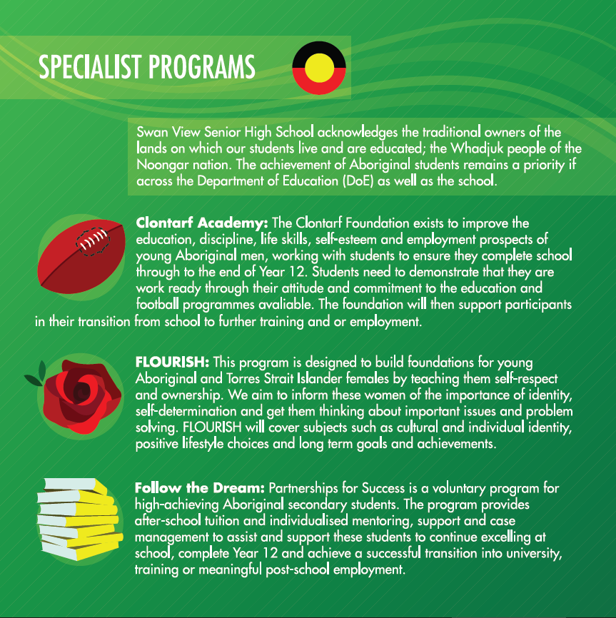
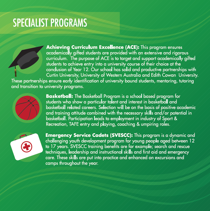
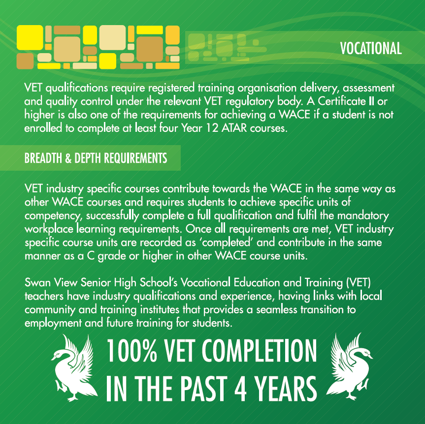
MEDIUM: The medium this project would take is a 15cm x 15cm square booklet stapled together on moderately thick paper that would be inserted into the annual report. The booklet would consist of 10 pages covering the topics of SVSHS’s nine specialist programs (three of which are for Indigenous and Torres Strait Islanders), What WACE is and how the parent’s child can achieve all the requirements to receive the certificate on completion of year twelve and how WACE can lead to either ATAR for those aspiring for university or Vocational Educational Training for those entering TAFE or the workforce.
STYLE: The style of the booklet was based heavily on the colours, fonts and wave flourishes featured on SVSHS’s logo and website since a brand style guide was not supplied. The main colours consisted of green, white, black, red and yellow; a complementary colour scheme with pairing neutrals which evoke growth, safety, happiness and passion. The main font of SVSHS’s logo Bembo is paired with the font family Futura, a modern sans serif font that pairs will with the simplistic transparent bars and wave flourishes that complement the design.
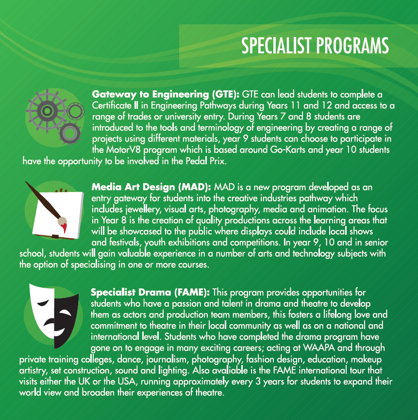
The illustrations used are also minimalist, using very few colours and clean lines that can convey an image with few details, this technique was utilised the most when creating the specialist program pictograms. The system of seeing that was used in these images was consistently using the colours red, yellow, black, white and shades of grey, with all the images using hard shading, high contrast, no outlines with minimal detail and a considerable graphic reduction.
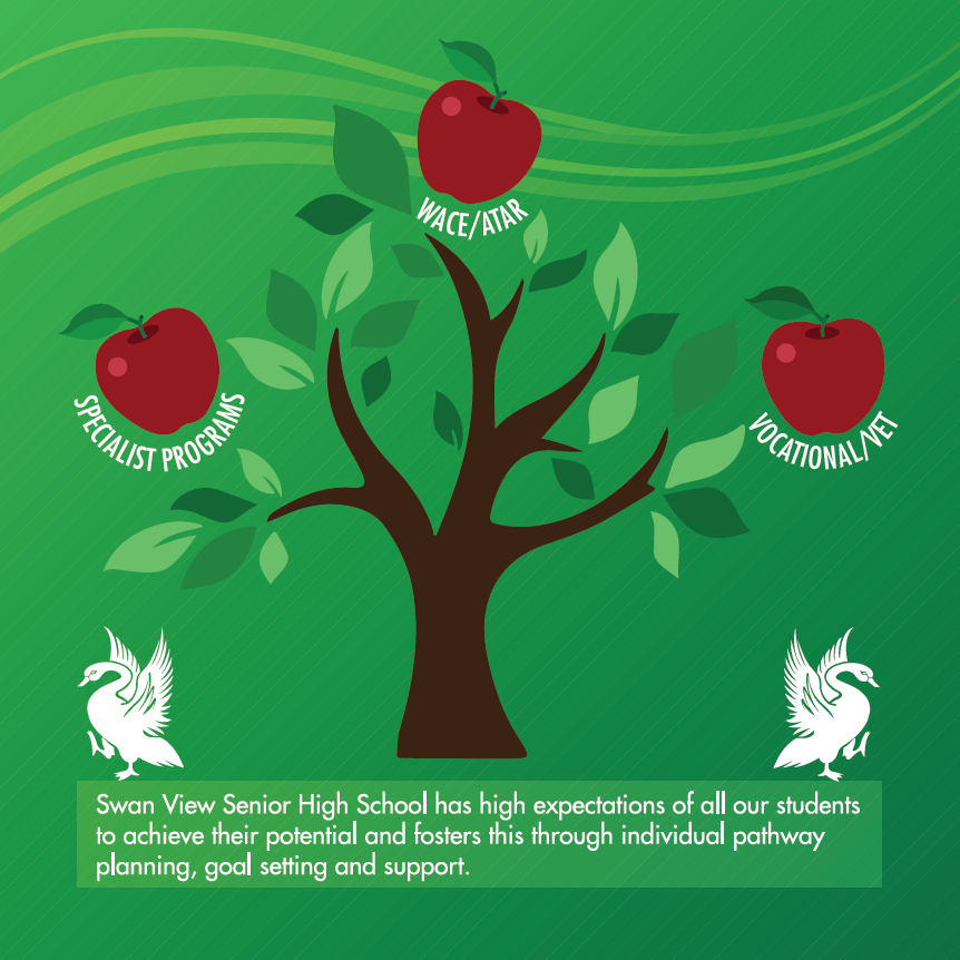
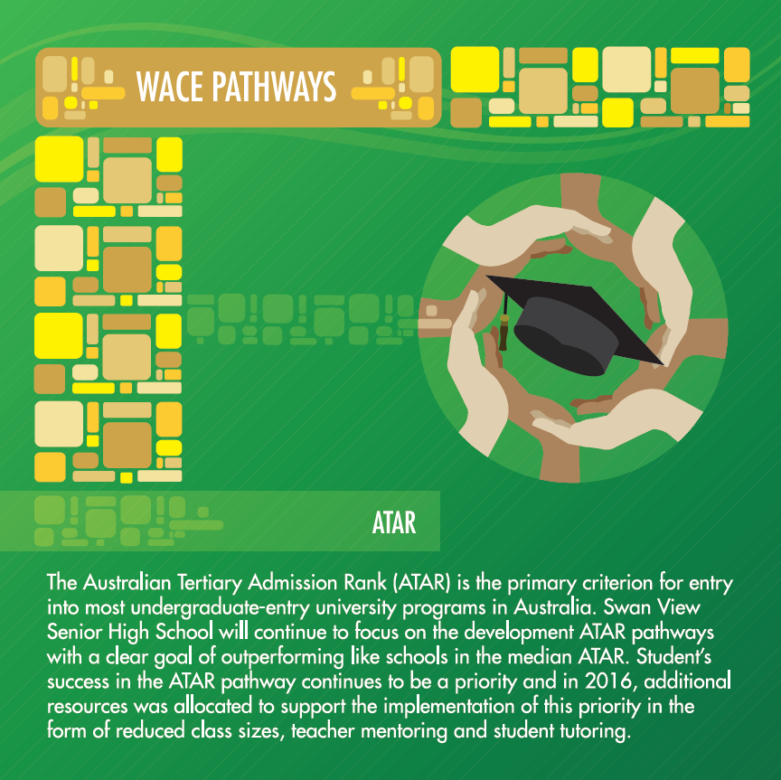
The purpose of these pictograms was to inform the user immediately without reading the summary, what the program was about and if it applied to their child. Two other symbolic images were used in this booklet were the contents tree and the ATAR image. The contents tree was used to replace the traditional contents page as there were not many pages in the booklet yet I felt the user would still need to know what topics the booklet covered. So this tree, held the apples of knowledge, informing the user of the topics in the book and evoking the idea of the tree of knowledge and the apples reminiscent of the teacher being given an apple and representing student growth and fruition of knowledge through certain pathways. The other image used for the ATAR section of a circle of different coloured hands around a graduation cap to represent family, teachers and the community working together in order to help student achieve graduation. A yellow brick road leading from WACE to either ATAR or VET is symbolic of a course of action that a person takes believing that it will lead to good things. In regards to the realism continuum addressed in one of the lectures, I believe my illustrations fall in-between concrete and abstract because they are simple yet objective and a combination of specific and universal aspects.
In conclusion, the SVSHS booklet would be an informative addition to the annual report because it would provide current and prospective students the information and opportunity to view the educational programs that SVSHS has to offer and inform the parent’s, teacher’s and the community the school’s motto, ‘Learning for Living’ and produce successful student’s in their educational and chosen career pathways.