Dircksey Student Magazine Covers
Project Background

Dircksey is ECU Student Guild’s editorially independent student magazine, established in 2015. Funded by the ECU Guild, it publishes four printed editions each year, aiming to entertain, enlighten, and showcase the diverse voices on campus. These free editions are distributed across all three ECU campuses. In addition to print, Dircksey also features online content, including articles, creative writing, and reviews, which allows students the freedom to write without specific themes or deadlines.
Target Audience
The target audience for Dircksey includes ECU students—both undergraduate and postgraduate—who are engaged with campus life and culture. It also encompasses faculty, staff, and alumni interested in the perspectives and activities of the student body. Additionally, the magazine appeals to local community members who are curious about youth culture and events, as well as aspiring writers and creatives seeking a platform to showcase their work. Overall, Dircksey aims to resonate with a diverse audience that values entertainment, creativity, and inclusivity within the university context.
Design Brief
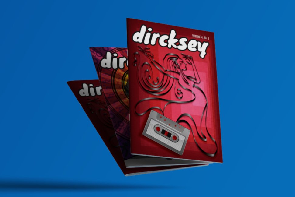
For my first Dircksey Cover, Vol 4. Ed 1, I aimed to convey a sense of nostalgia and individuality through my design, inspired by the powerful role of music in self-expression. The cassette tape symbolizes this connection, while the woman formed by the tape, striking a confident 'whatever' pose, embodies defiance against societal norms. With no design brief, I had the creative freedom to craft something interesting and exciting, enticing readers to pick up the magazine and delve into its contents. This image celebrates personal freedom and creativity, merging past influences with a contemporary attitude. It’s about embracing who you are and making a bold statement.


Design Brief
For my second Dircksey Cover, Vol 4. Ed 3, I designed a magazine cover featuring a polygonal man with glowing yellow eyes against a backdrop of zodiac symbols to convey a sense of mystique and cosmic connection. The polygonal shapes reflects the complexity of identity and the multifaceted nature of humanity, while the glowing eyes symbolize heightened awareness and insight. The zodiac symbols emphasize the influence of astrology and celestial bodies on our lives. With no design brief for this project, I embraced the creative freedom to craft an impactful image. Additionally, in response to complaints at the guild regarding the representation of women and issues of objectification, I aimed to promote equality by featuring a male figure. Ultimately, this design embodies themes of self-discovery, the search for meaning, and the interplay between individuality and the universe.


Reception
Overall, the ECU Student Guild and students of Edith Cowan University responded enthusiastically to both magazine covers, finding them refreshing and engaging. The cover featuring the polygonal man resonated well, as it highlighted themes of individuality and cosmic connection while also addressing the important conversation around equality in representation. On the other hand, the cassette tape design captured a sense of nostalgia and self-expression, drawing readers in with its playful and confident vibe. Together, these covers sparked meaningful discussions about identity and creativity, perfectly aligning with the diverse voices that Dircksey aims to celebrate.
