Quokka Apocalypse for Fringe World 2020


Project Background
Public Service Announcement (PSA) is a performance collective based in Perth, Western Australia, known for productions like The Cockburn Incident, Cookies & Cream, and Grace. I was tasked with designing a promotional logo and banner for their 2024 Fringe World production, Quokka Apocalypse. Created by playwright Zachary Sheridan and producer Emily Stokoe, the play explores themes of rebellion against human oppression through the eyes of animals, blending social commentary with a comedic tone.
Target Audience
The target audience for Quokka Apocalypse consists primarily of young people aged 13 - 25, with a strong focus on engaging local Perth communities. This audience enjoys quirky, playful, and imaginative experiences, falling within the genres of humor, action and fantasy. They are often drawn to unique stories with relatable characters and enjoy entertainment that fosters a strong sense of local pride and cultural connection. Fans of pop culture and indie projects, especially those embracing Australian wildlife, are likely to resonate with this fun and creative project.
Design Brief
Quokka Apocalypse is a West Australian world premiere that follows Quokka, Possum, and Snipe as they plot to overthrow their greedy human overlords using only a bottle of dishwashing detergent and access to Perth's water supply. The play explores themes of power dynamics in the face of impending doom, presenting a bold and entertaining take that rivals classic tales like Blinky Bill.
To spark my creativity, public service announcement provided a mood board that featured animal masks, a vaporwave aesthetic, and Wes Anderson’s Fantastic Mr. Fox (2009). Drawing inspiration from the science fiction genre, I developed thumbnail sketches influenced by Men in Black (1997), while referencing the space patches I had previously designed for the 'Orbituaries' article for Dircksey Magazine 2019 Issue 2: Vol.5 I Glitch. I explored additional variations centered around core script elements; including the animal team, detergent and the bubbles is creates, a UFO to representing the alien threat and the Perth city skyline - ultimately blending local and extraterrestrial imagery.


Concept & Inspiration
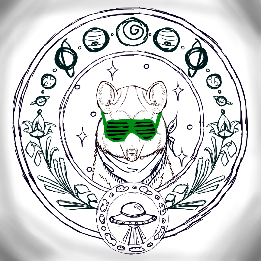
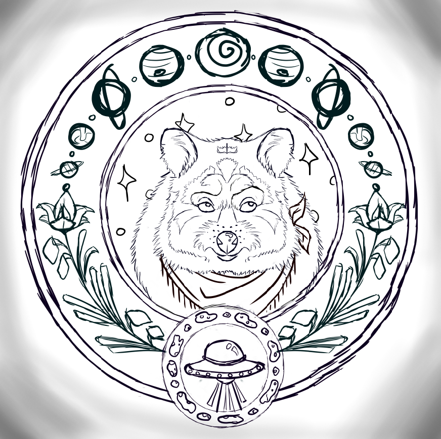
After presenting my initial sketches for the Quokka Apocalypse design brief, the client expressed a keen interest in the space patch concept. We collaborated closely to refine the design elements, deliberating over various aspects such as whether to include the title of the show within the patch, the depiction of the solar system around the perimeter versus the native vegetation that quokka’s typically consume. We also considered the quokka's trademark bandanna and debated its body positioning, whether to portray it facing front-on or at a 3/4 angle. Additionally, we discussed incorporating key elements from the script, such as the golden key and bubbles vs the UFO and asteroids in a smaller micro patch at the bottom. This collaborative process allowed us to hone in on a final design, which served as a foundation for creating variation sketches to explore different possibilities further.


Design Process
During the design process for Quokka Apocalypse, I provided two sets of variations, each with three examples. The first set showcased a thin quokka, appearing angry and directly confronting the viewer, accompanied by different styles of vaporwave sunglasses. I ensured the elements of the solar system, native vegetation, UFOs, and asteroids remained consistent across these variations. However, after the initial review, we concluded that the quokka's expression was too aggressive and didn't reflect its natural demeanor. This feedback led to the development of a second set, featuring a fatter, more confident quokka design. This approach was recieved more positively, and we ultimately decided to proceed with Set 2: Variation 1 to further render for completion.


Reception
Quokka Apocalypse garnered positive acclaim from various critics, highlighting its unique blend of humor and social commentary. According to Stage Whispers, the play delivers a clever narrative that effectively critiques human greed while showcasing the resilience of its animal protagonists. Isolated Nation praises its vibrant visuals and engaging performances, noting the energetic direction that brings the quirky storyline to life. Gutter Culture emphasizes the play's themes of revolution against oppression, lauding its ability to resonate with contemporary issues while maintaining a lighthearted tone.
Additionally, the final logo and banner images for Quokka Apocalypse were prominently featured in the Fringe World 2020 festival catalog, the The Blue Room Theatre’s Summer Nights program of theatre and performance at Fringe World, and various posters and flyers at The Blue Room venue where the performance was hosted. Overall, Quokka Apocalypse was celebrated for its originality, wit, and the way it captures both local charm and universal truths, making it a standout production.


